
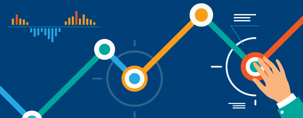
Data Visualization
A picture is worth a thousand words and it is so relevant when it comes to analyzing millions of rows of complex data. Data visualization simplifies complex data presentation through a graphical and pictorial way. It gives a simplified way for C-Level executives and managers to quickly understand intricate concepts and spend more time on corrective actions. Interactive visualization makes analysis even more informative and focused.
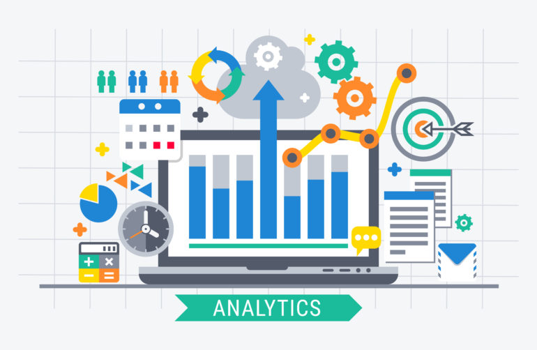
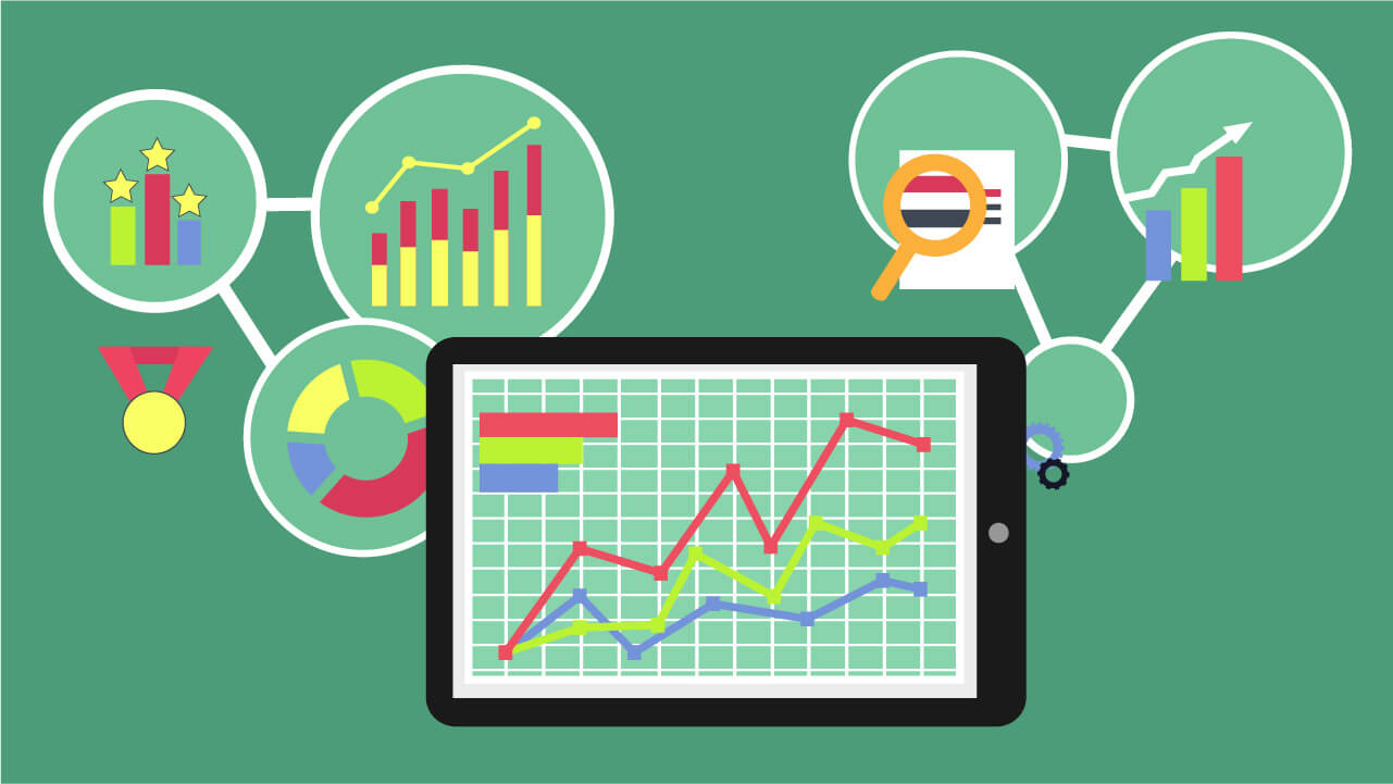
Visualizations in a dashboard through graphs, charts, gauges, and maps is not only engaging but gives user a full perspective of the domain on a single screen could it be of a mobile, tablet, laptop or a large screen. Drill through and drill down allows to inspect the granular details. In addition to using these controls different color, shades, font size, shapes, orientation add another dimension to the analysis.
Descriptive Analytics:
This is what you get from your web server through tools like Google Analytics, Omniture or the like. You can quickly understand “what happened” during a given period in the past and verify if a campaign was successful or not based on simple parameters like page views. About 35% of companies surveyed say they do this consistently.
Diagnostic Analytics:
If you want to go deeper into the data you have collected from users in order to understand “Why some things happened,” you can use business intelligence tools to get some insights. However, it is very laborious work that has limited ability to give you actionable insights. It basically provides a very good understanding of a limited piece of the problem you want to solve. Usually less than 10% of companies surveyed do this on occasion and less than 5% do so consistently.
Predictive Analytics:
If you can collect contextual data and correlate it with other user behavior datasets, as well as expand user data beyond what you can get from your web servers, you enter a whole new area where you can get real insights. Essentially, you can predict what will happen if you keep things as they are. However, less than 1% of companies surveyed have tried this yet. The ones who have, found incredible results that have already made a big difference in their business.
Prescriptive Analytics:
Once you get to the point where you can consistently analyze your data to predict what’s going to happen, you are very close to being able to understand what you should do in order to maximize good outcomes and also prevent potentially bad outcomes. This is on the edge of innovation today, but it’s attainable!
We have data scientist experts in data mining, statistics, modeling, machine learning and artificial intelligence across different domains. Once the KPIs are identified, we monitor them over time to measure various quantitative messages like correlation, distribution over time, comparison, geospatial distribution, trends and variance, identify patterns and watch-out for deviations.
Even the Big Data like internet activities, log data after its aggregation can be effectively depicted through visual presentation. It provides a platform to explore, compare, monitor large business modules all at once in a compact and coherent way. Graphical representation is very precise and conclusive than statistical computations. Data scientists and engineers have an important role in solving and simplifying the analytical challenges of data visualizations, so that once the information represented graphically its accurate and verified.